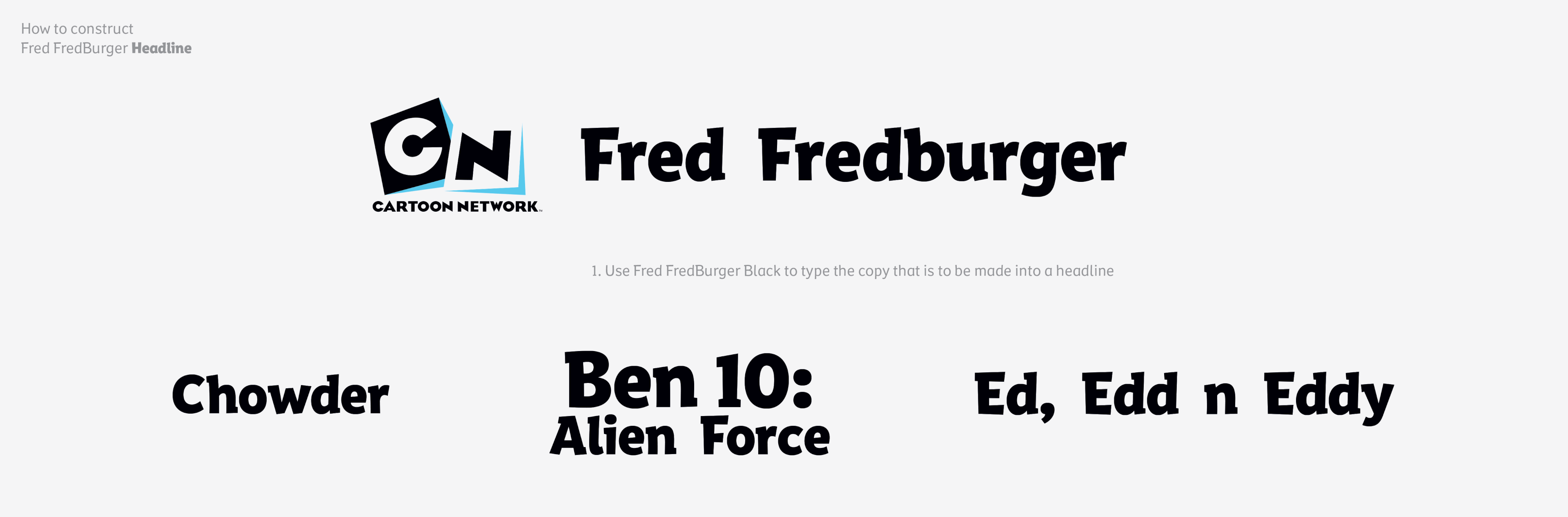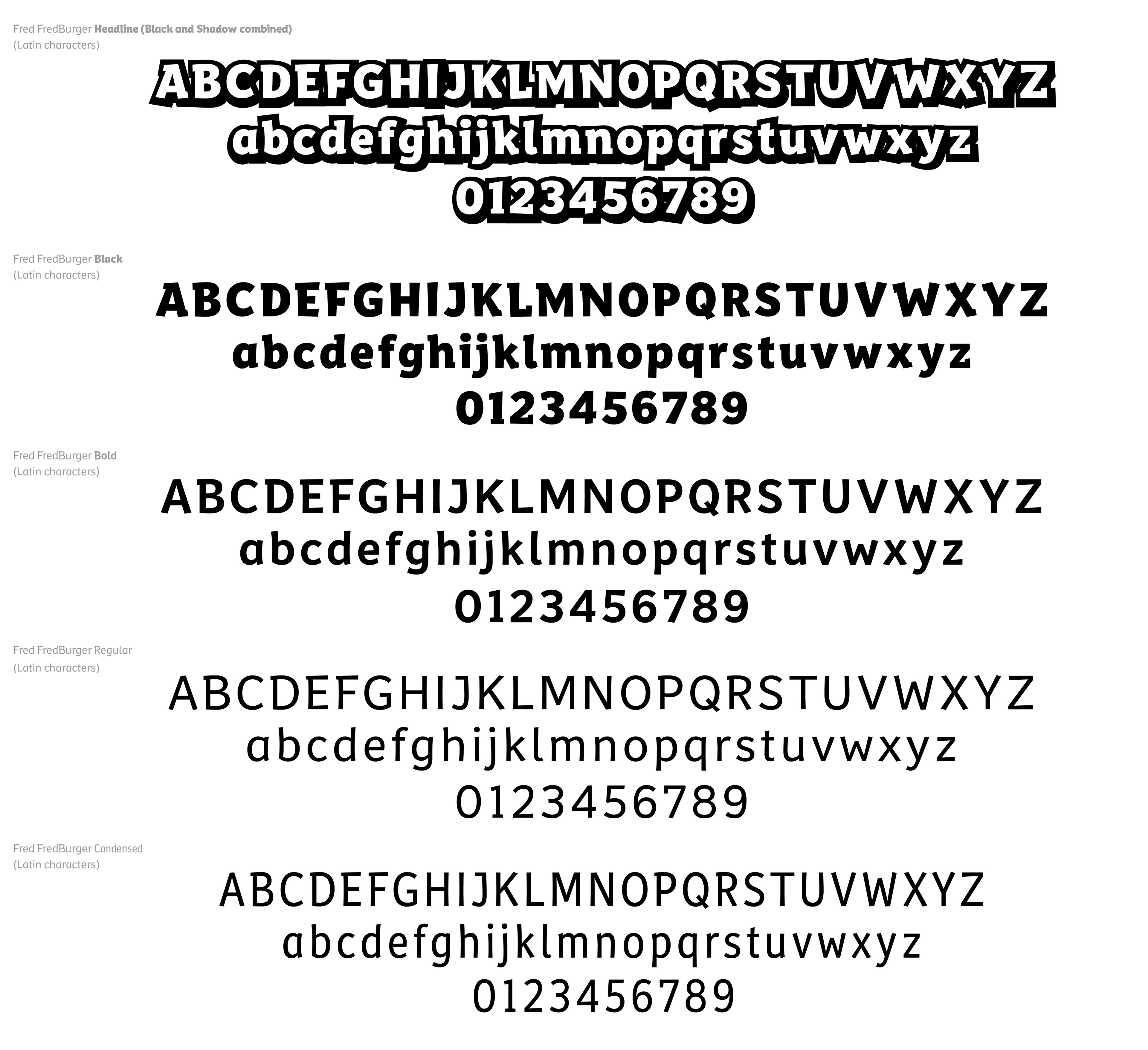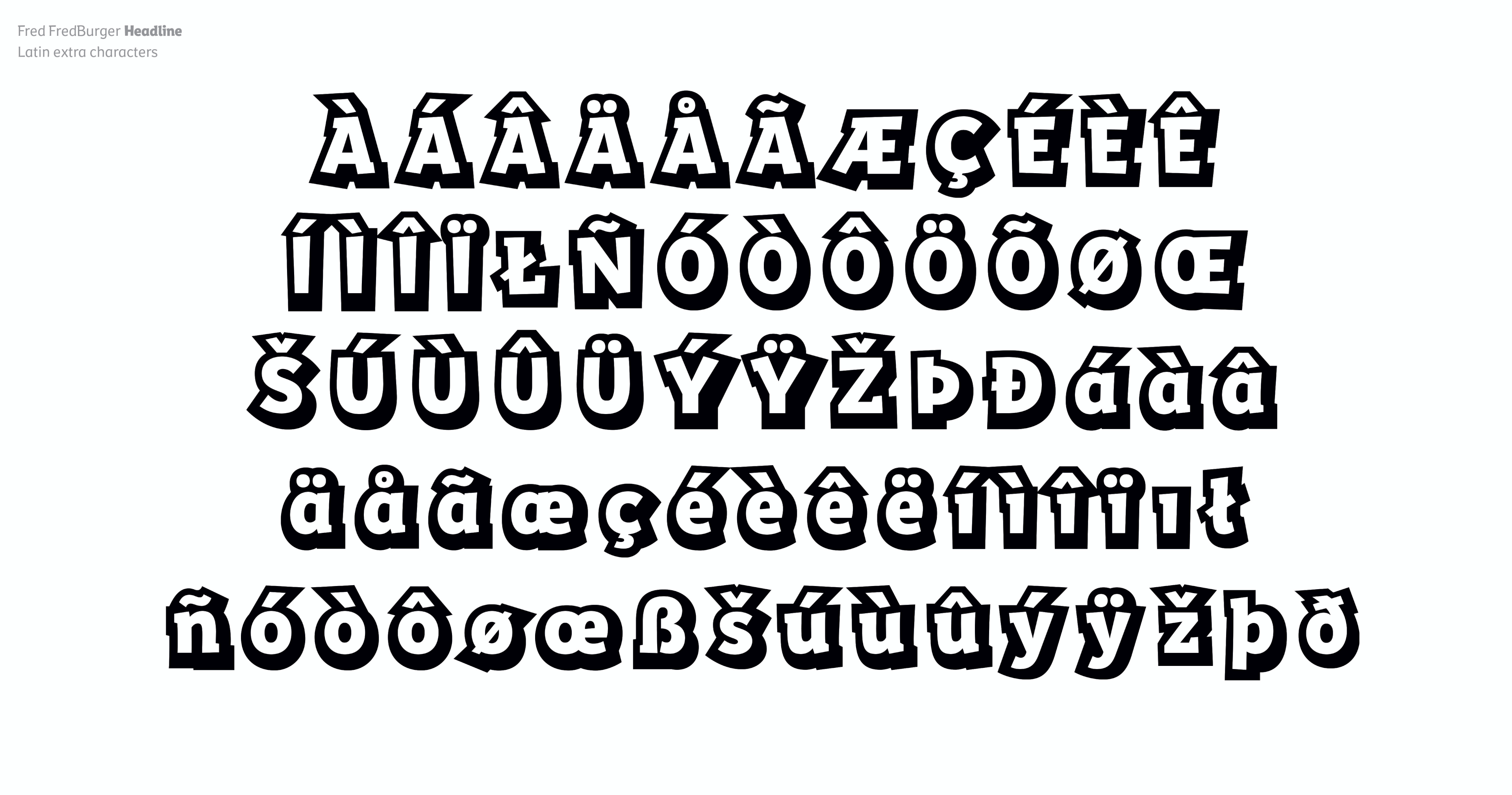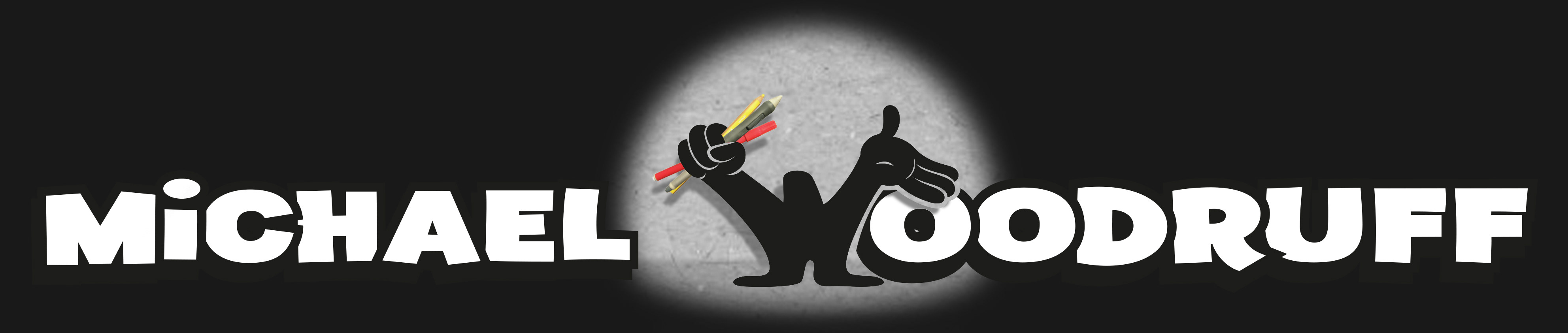
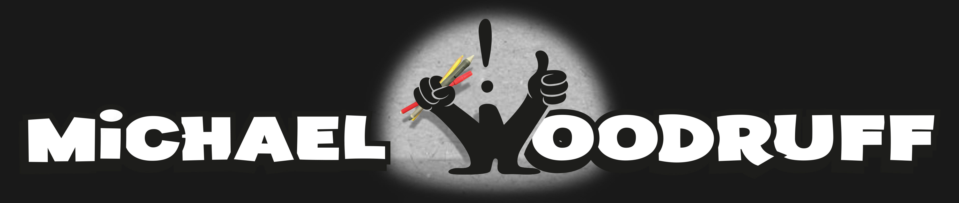
Channel brand typeface in five weights delivered in Latin, Cyrillic, Greek, Hebrew and Arabic
With a large range of languages in use across Cartoon Network's growing EMEA region, maintaining the visual consistency of the channel branding had become more of a challenge. The font used for the English language did not fully cater to most of these regions and there were no similar looking alternatives so creating a new, bespoke typeface was proposed.
Working with Monotype we developed a unique typeface that would be fully owned by the channel, with the aim of becoming synonymous with the brand.
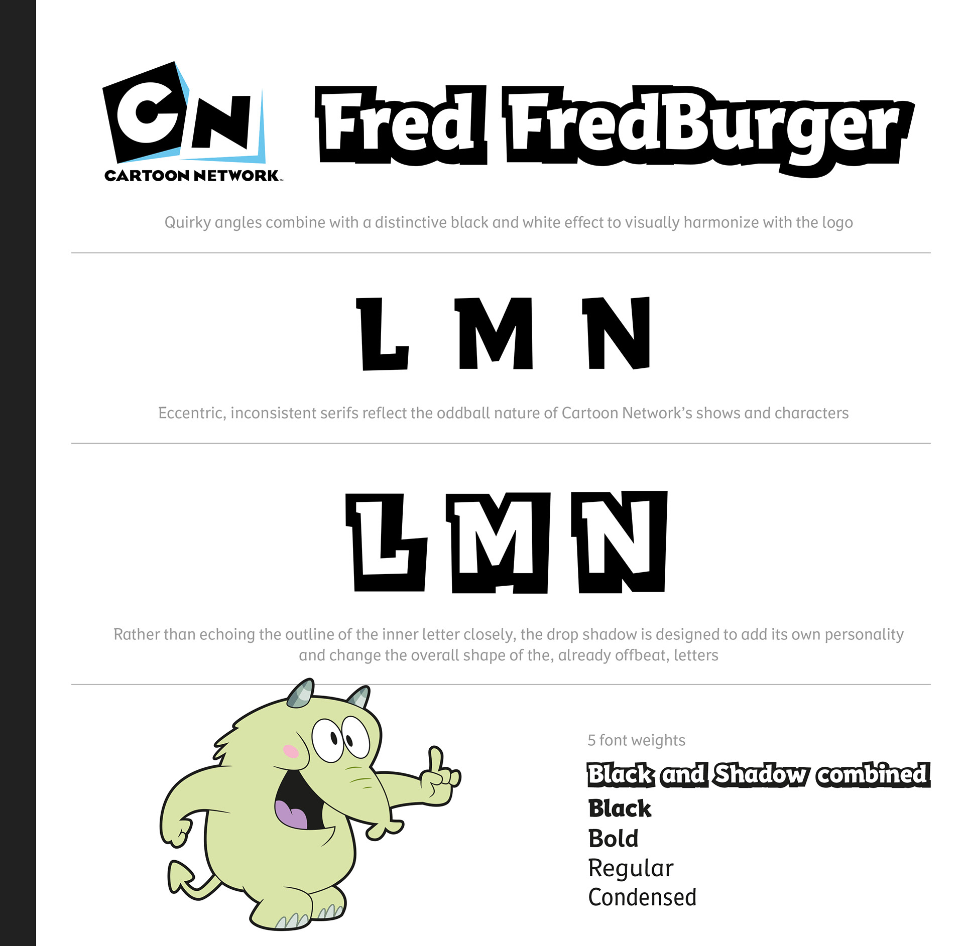
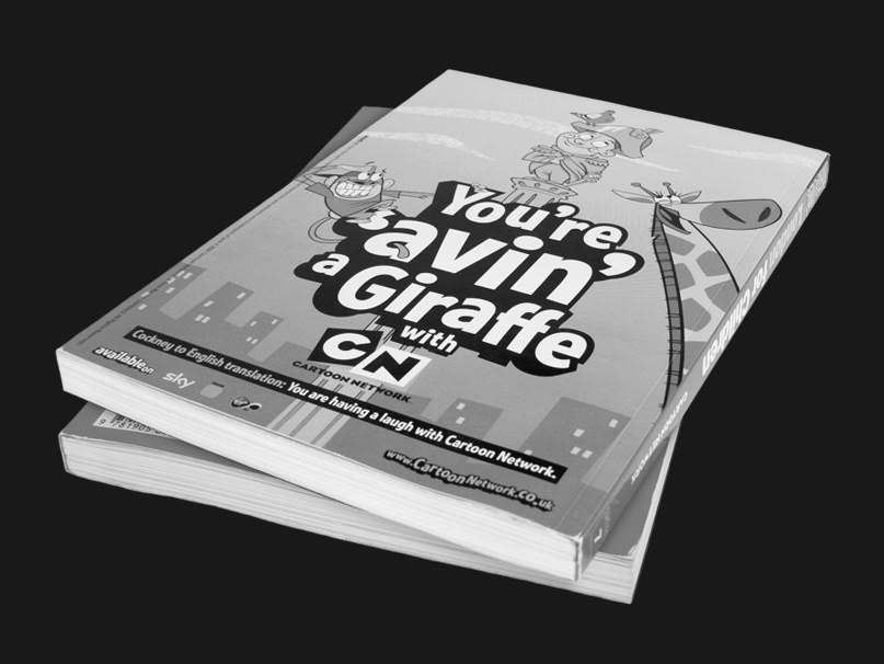
Previously an off-the-shelf font had been used with a heavily outlined drop shadow effect gaving a distinct black and white look, tying into the logo. We wanted to retain this aspect, but we now had scope to harmonise visually with the shape of the logo - at the time, this was the 'tiled' logo - quite an unbalanced, angular logo.
Usable typefaces are typically only a single colour so the drop shadow effect is achieved by overlaying two font weights. This 'limitation' allowed us to design a drop shadow that didn't dutifully follow the shape of the inner letter, giving a headline or title a more randomised, oddball feel, reflecting the channel's programming and earning the name of one the most offbeat characters on the network.